SMACSS and Responsive Web Design
SMACCS (Scalable and Modular Architecture for CSS)
Which basically means dividing your CSS code into multiple categories which makes easier to be edited later.
SMACCS can be done by dividing your code into the following categories (CSS files):
1- Base.css: which contains the lines that are the most general which you’re gonna apply to the multiple and parent html elements.
2- Layout.css: from its name, in this you write the rules for your page layout which is a bit more specified than those in the base.css.
3-Module.css: here we apply the rules regarding some elements that need more adjustments to be done to their dimensions for example, which again here you’re being more specific than you’re in layout.css.
4- Theme.css: last file here your applying the rules regarding coloring and font styling.
Responsive Web Design
Which basically means designing websites to suit every screen size, whether the website was opened with a mobile phone or desktop … etc.
That can be done by the following:
1- Using percentages instead of absolute values when specifying dimensions.
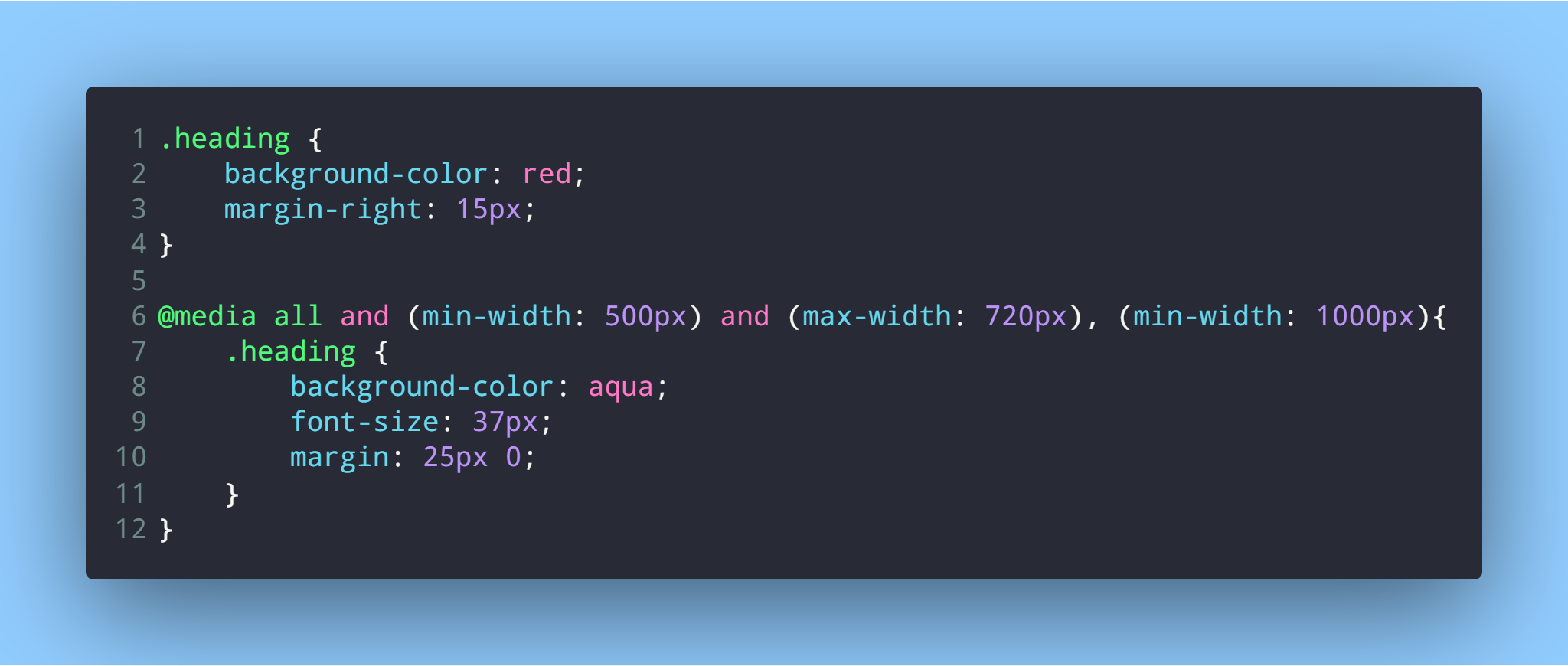
2- Using media query: media query writing some css rules which will be applied when a conditions (screen dimensions) is applied, as the following:
 .
.